brand identity / collage
.
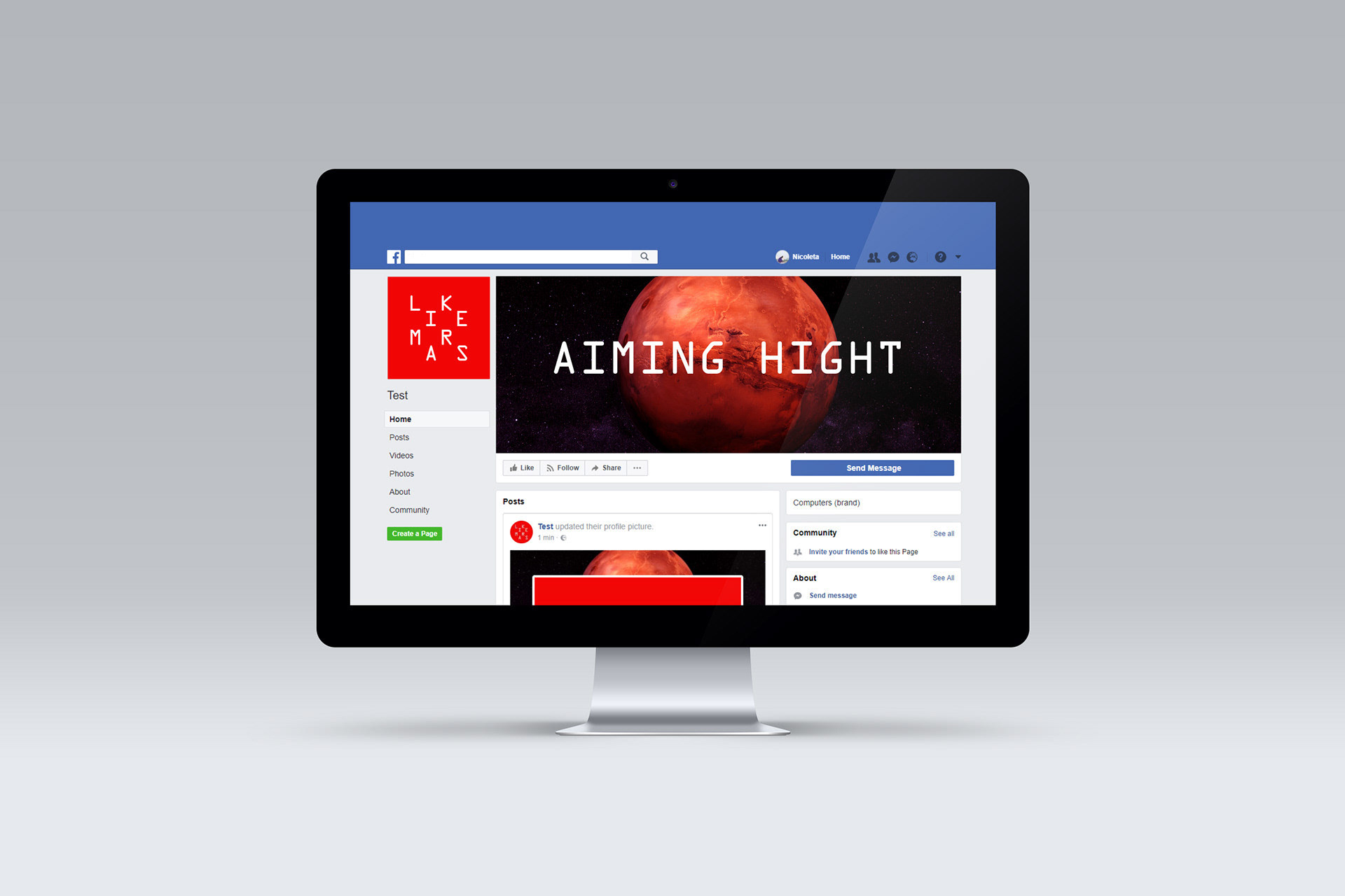
LikeMars is a young social media agency based in Moldova with an innovative vision and big aspirations. The logotype and font create a rhythm and grid inspired by data transmission. How can we represent the connection between Earth and Mars, or between advertiser and buyer?
Like for like
Collages are a clear reference to Moldova’s soviet buildings in contrast with a sci-fi related font with a strong personality and the planet Mars. At the same time, all these elements gain their own expression. Movement and rhythm are represented by the different composition varieties, generating the personality of the identity

.
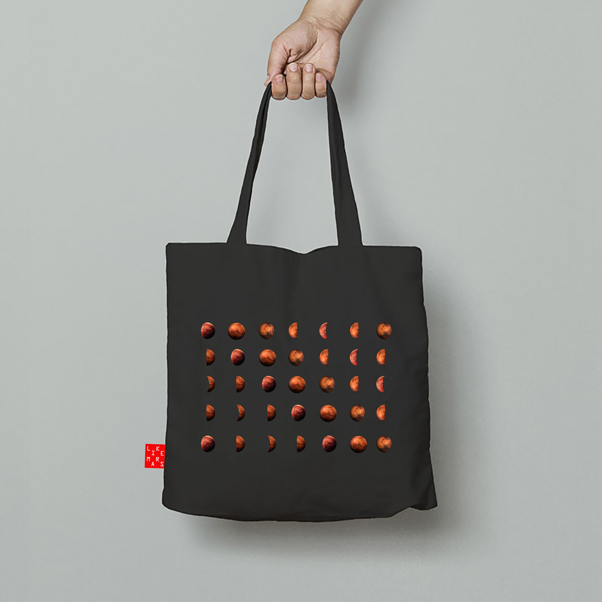
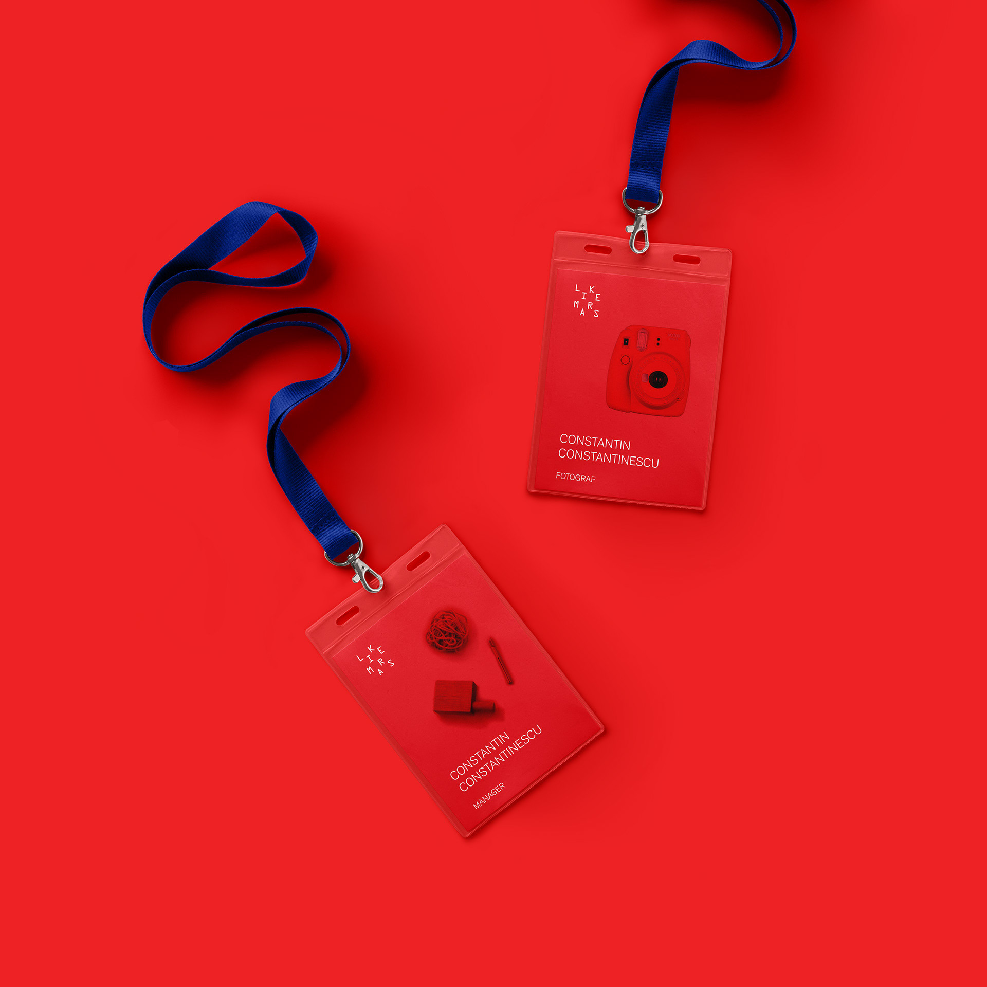
The visual identity and communication combine a typography-based logotype, emphasizing our shift to digital, and blending tech aesthetics with collages. The bold red brand colour, paired with a monospace font that reflects the digital transformation, creates a cosmic vibe, further enhanced by playful collages.
Year: 2018


