
logo design / brand identity

.
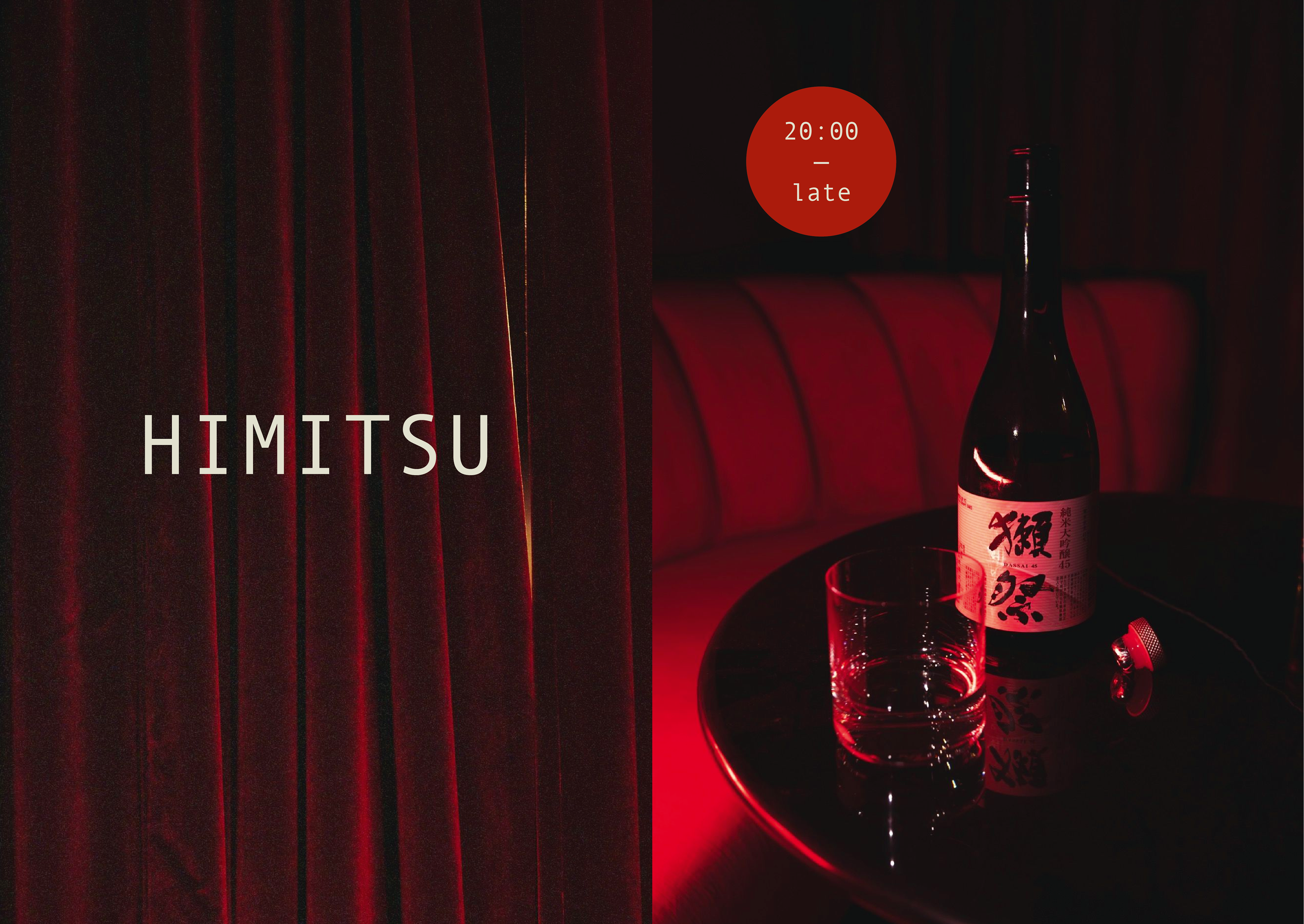
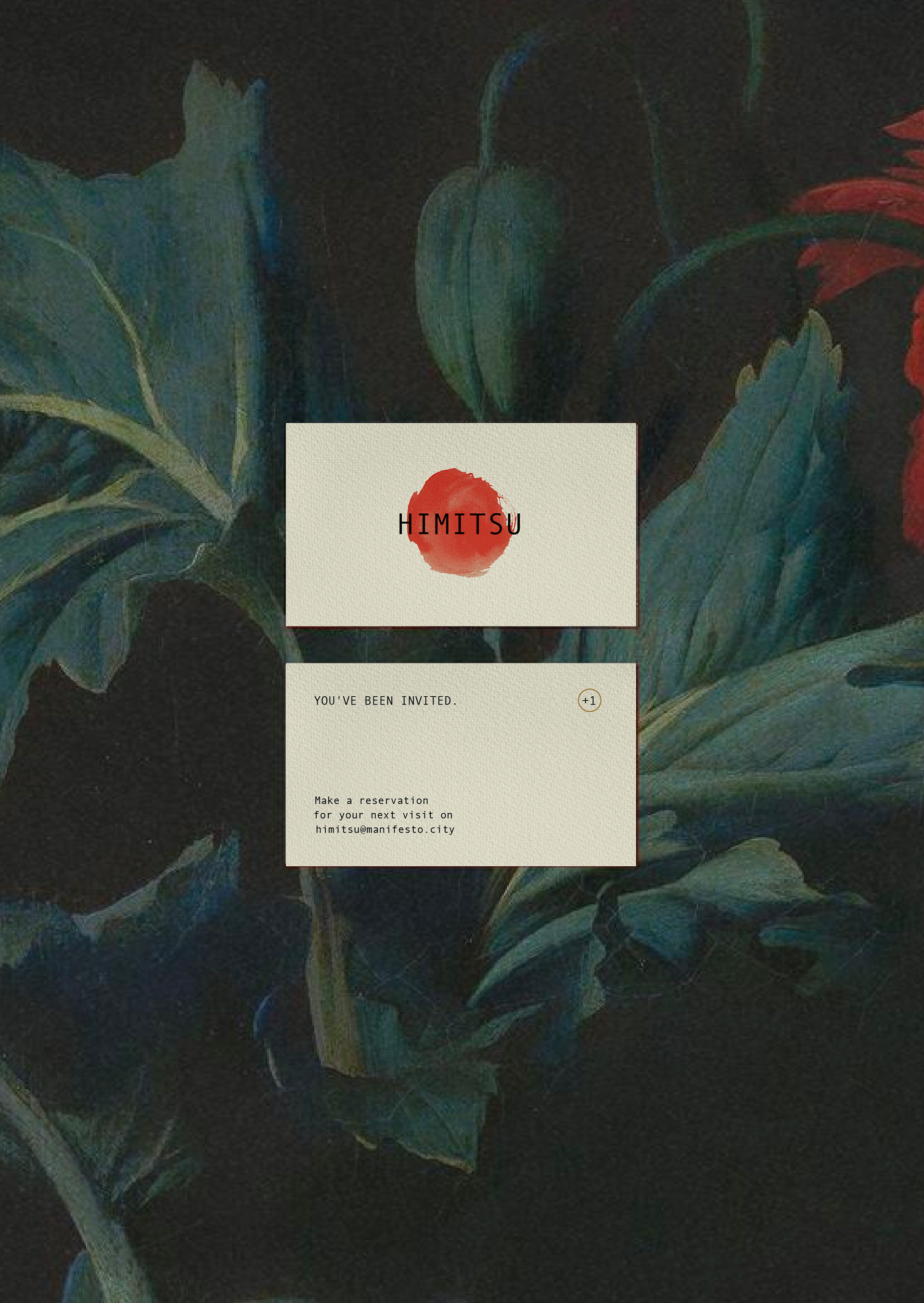
The visual identity for Himitsu reflects the mysterious allure of a hidden Japanese speakeasy. Inspired by the Japanese flag and echoed on the bar’s entrance curtain, the hand-painted red circle symbolizes tradition and the craft of ageing cocktails in ‘Kame’ pots. This bold, organic motif, paired with a minimalist palette, captures the purity, precision, and craftsmanship central to the Himitsu experience.
.
Photography ↓
Vaclav Miskovsky